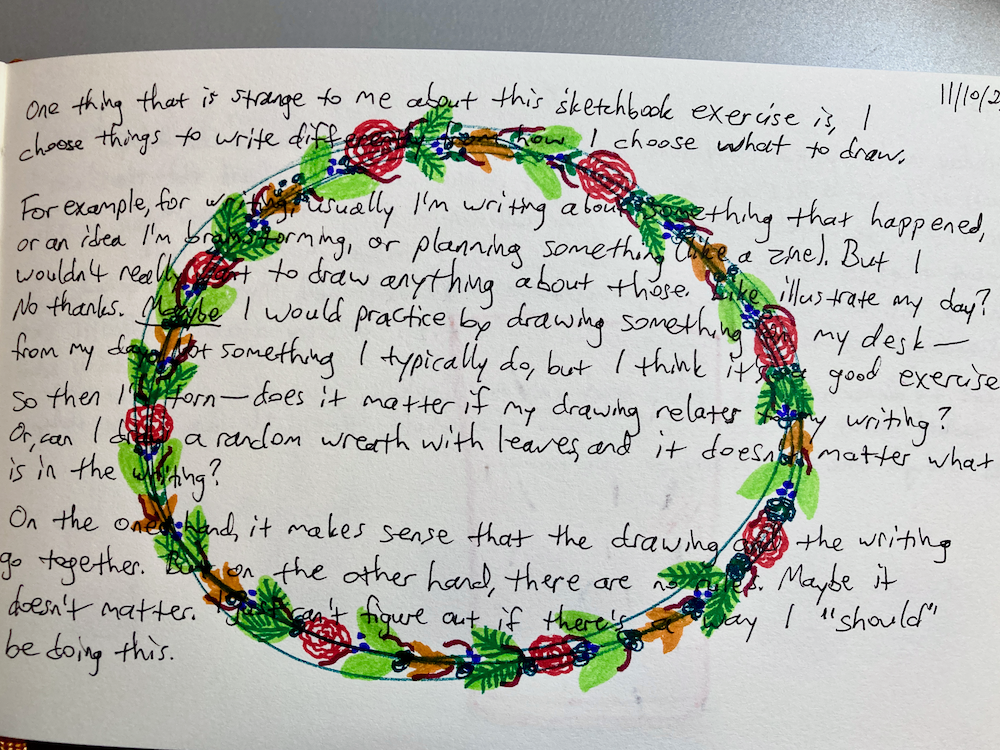
drawing
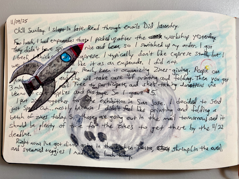
11/23/25
For the past three Saturdays, I’ve been spending wonderful afternoons in a local workshop series called “Living Sketchbook.” We were encouraged to use sketchbooks as tools to capture ideas, experiment with types of media, and try new approaches.
During the first workshop, we spent some time writing about the past week. Then we drew over the text. The drawing could be related to the text, or it could be separate.
We spent the second workshop collaging. I liked looking for different textures or contrasting colors to glue next to each other.
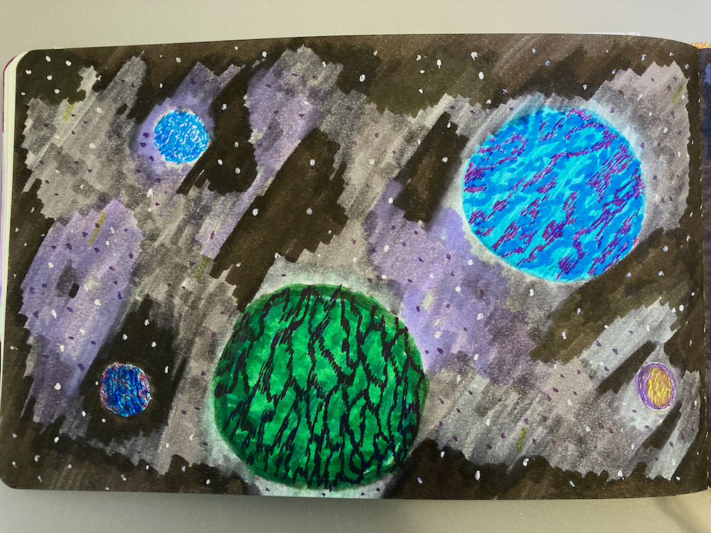
The third workshop was to experiment with using different types of media together. I chose Tombow brush pens and Ink Joy gel pens — two things I haven’t tried using together in the same drawing.
Up to now, I’ve used sketchbooks on and off, when I had an idea to work on or new tools to try out. I didn’t know what made sense for me to do in a sketchbook on a consistent basis. This workshop series was helpful to see different approaches to keeping a sketchbook practice.
10/3/23
I watched Elemental without knowing what to expect, because Disney’s marketing missed the mark (again). But I liked the movie overall. One of my favorite parts was seeing how each character used their element, like Ember inflating a hot air balloon.
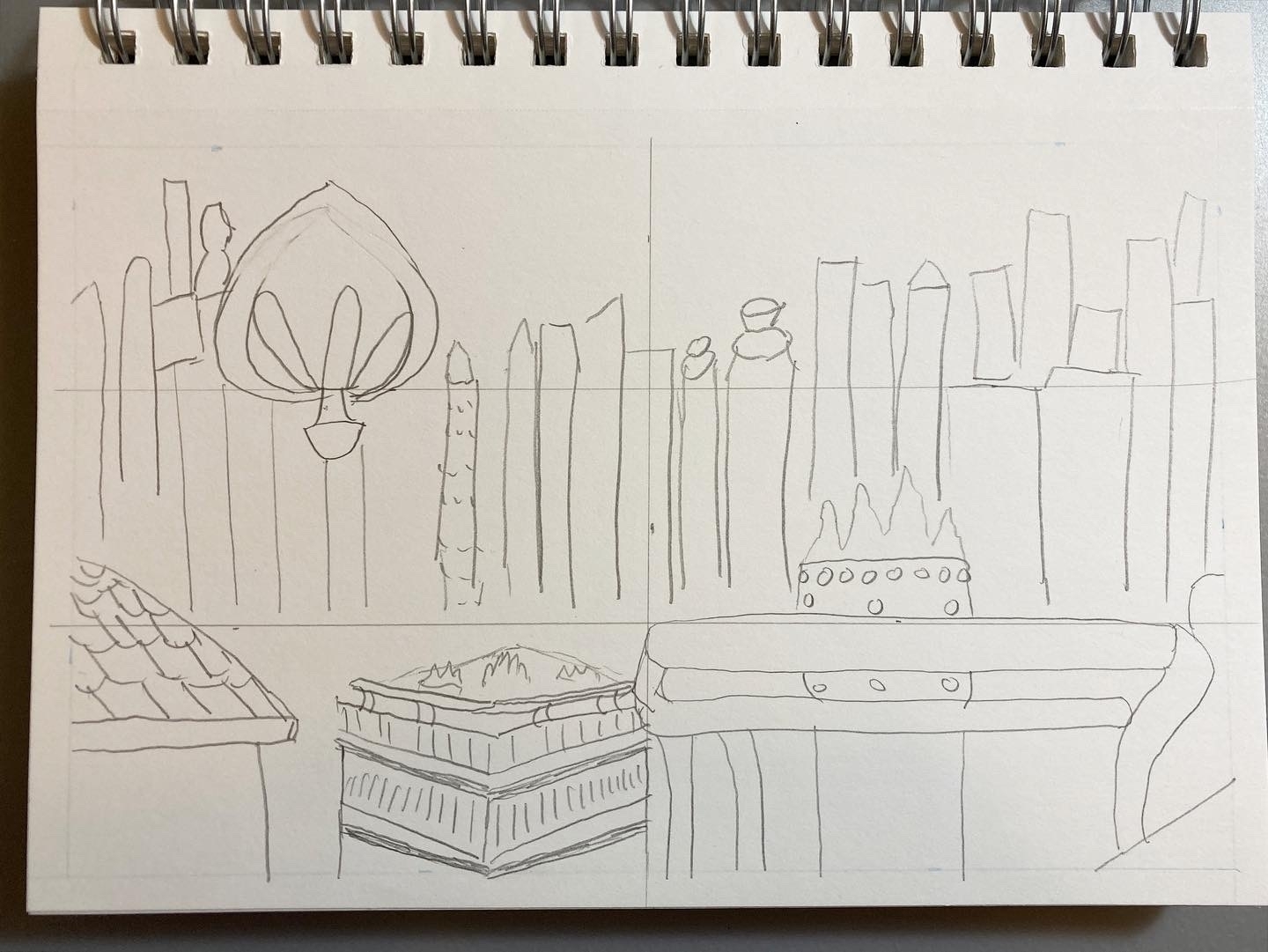
I wanted to draw the scene with the hot air balloon floating over the city. I started with a pencil sketch. It’s rough. I wanted to figure out the foreground vs. the background and where the balloon was in the sky, in relation to the skyline.
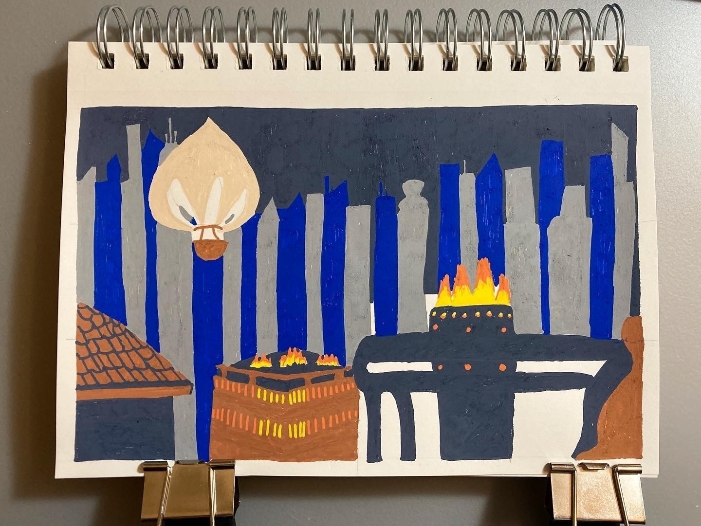
Here’s a photo of when I was painting the larger areas. I simplified colors and composition (all those buildings!) because it’s so much detail.
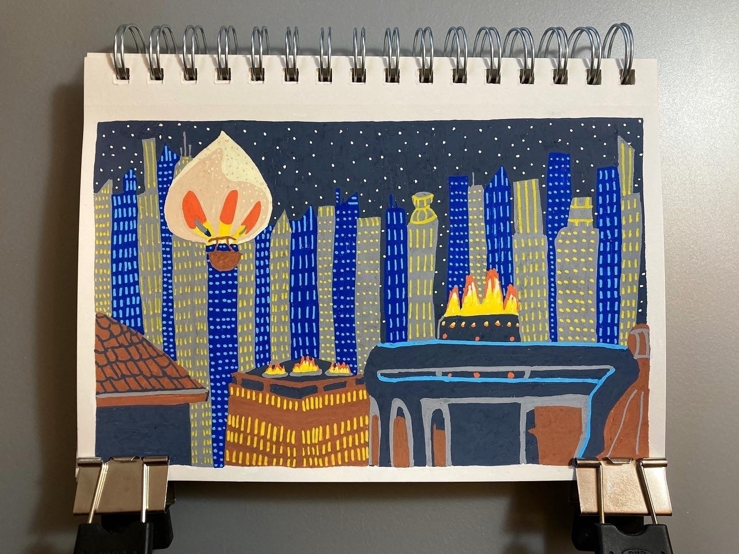
Here’s the finished drawing.
4/12/23
Here’s an illustration of Bruce Wayne’s mansion (Wayne Manor).
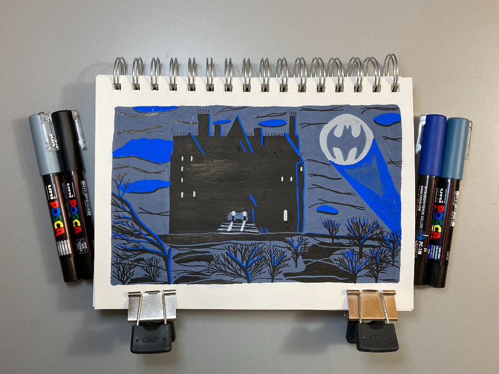
I really like how the blue highlights contrast against the black on the building and the trees.
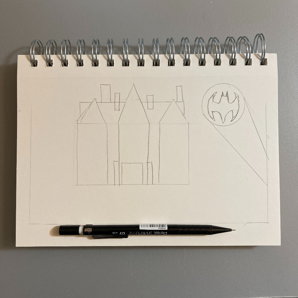
Here’s the pencil sketch I started with.
4/10/23
Here’s an illustration of Bluth’s Original Frozen Banana Stand from Arrested Development.
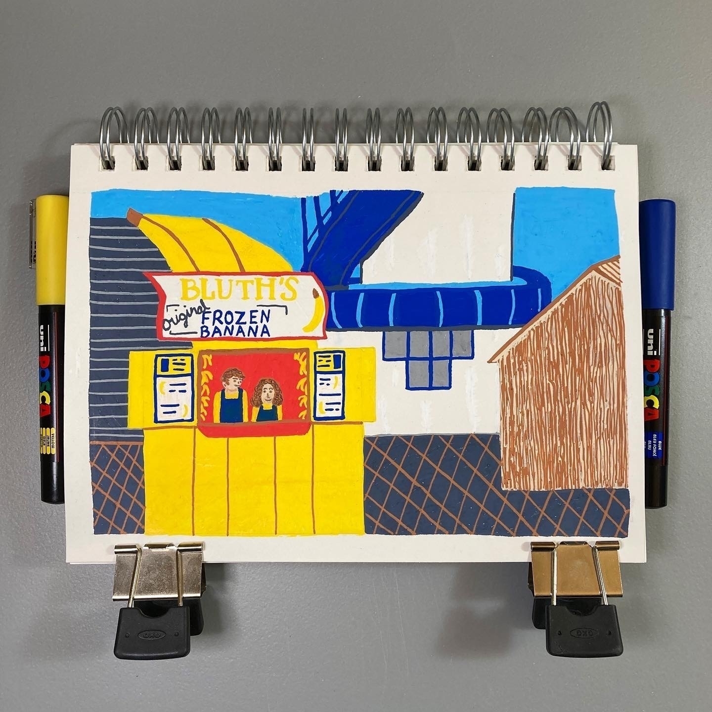
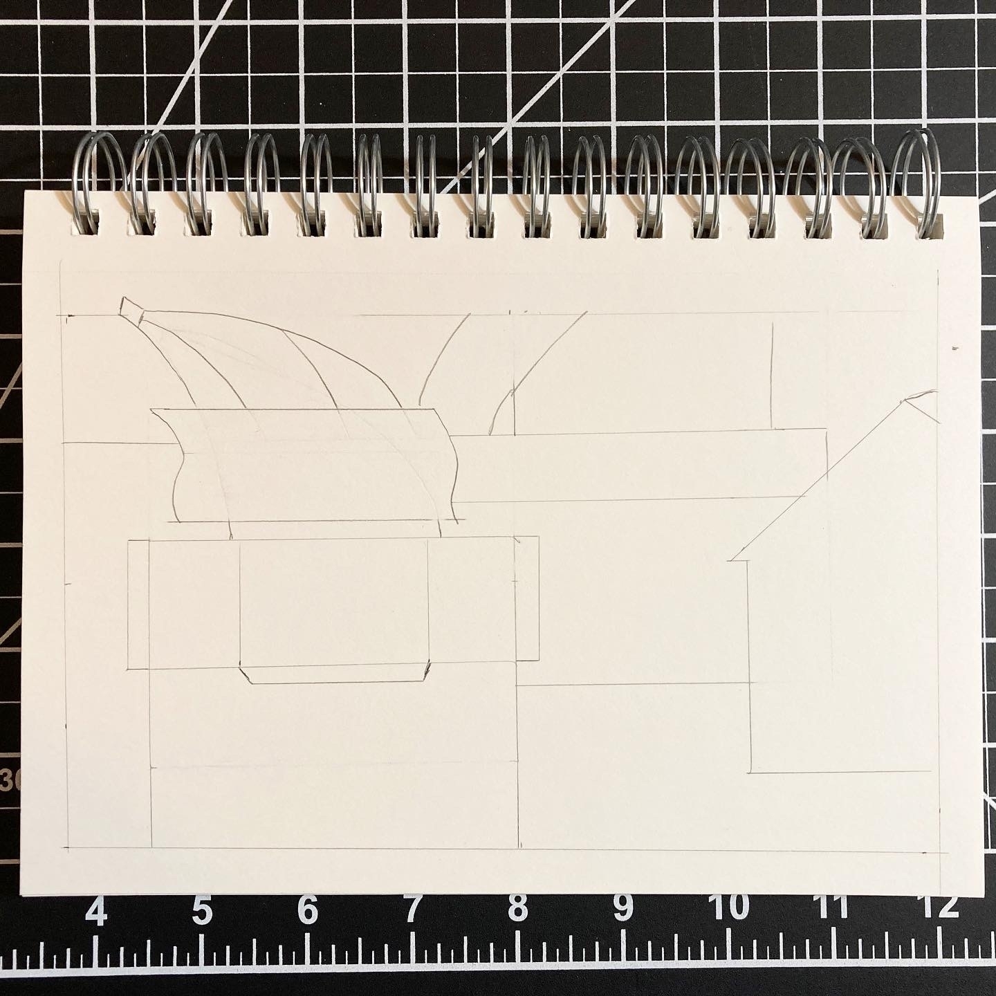
I started with a pencil sketch to draw the outline of each building.
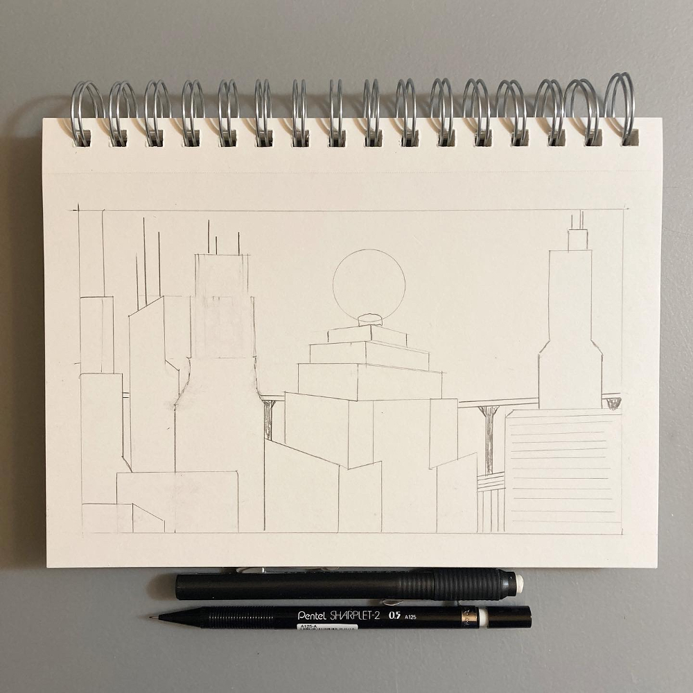
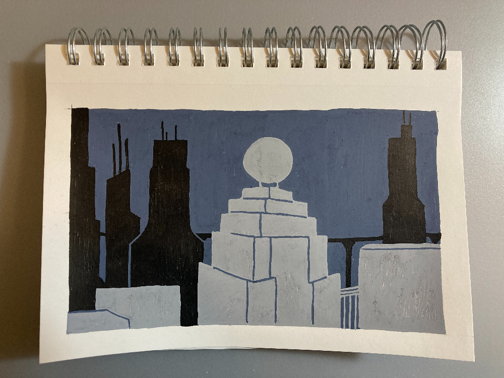
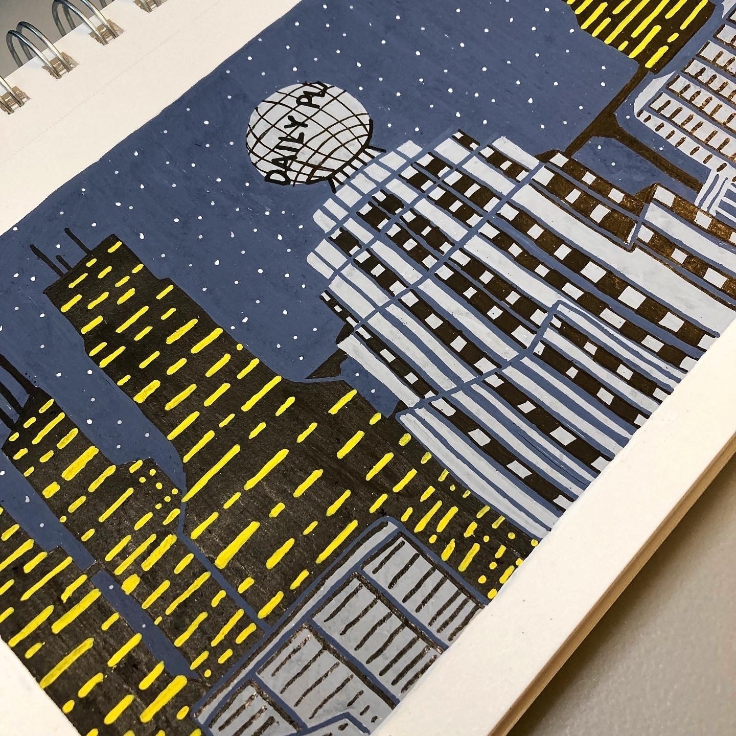
2/19/23
Here’s an illustration of the Metropolis skyline at night.
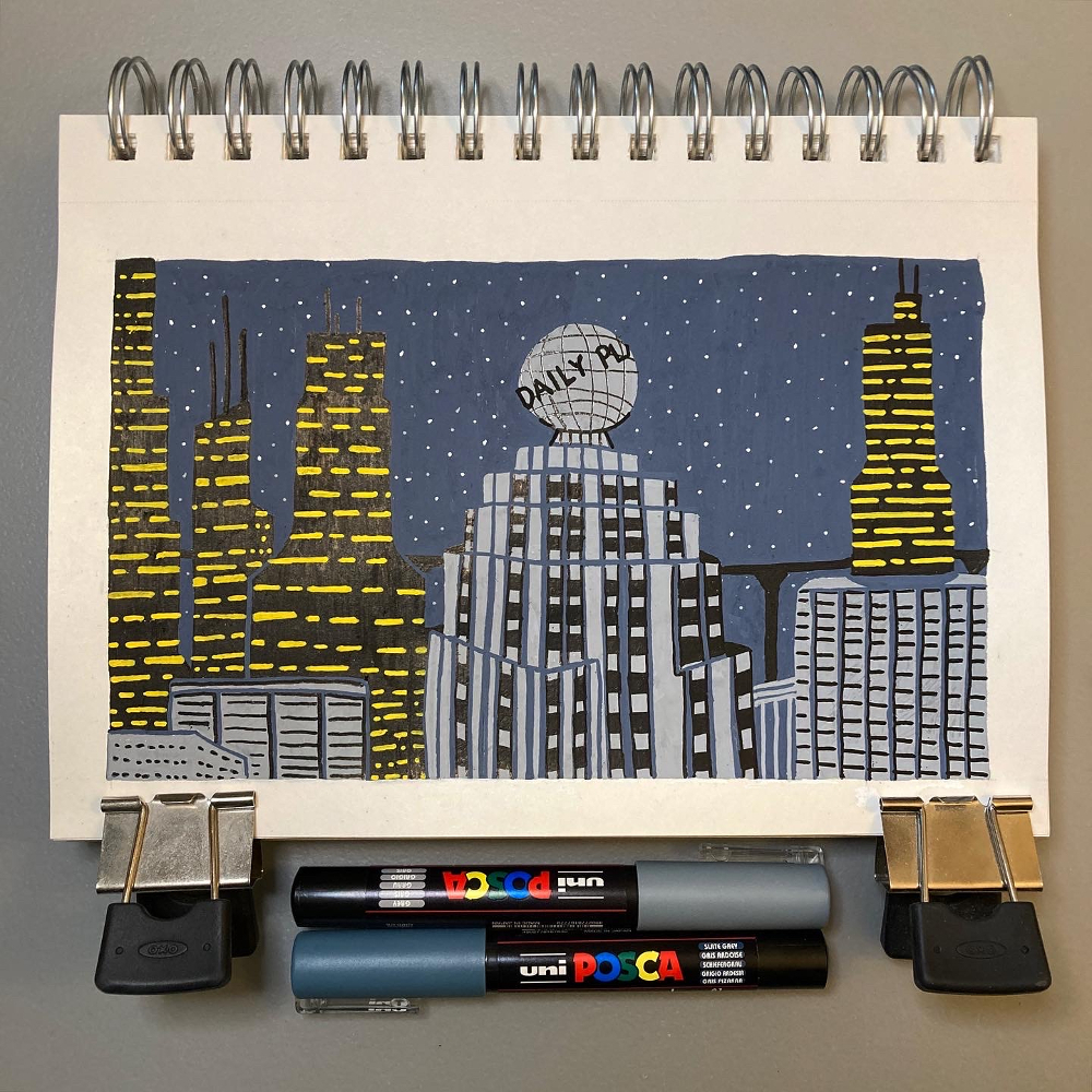
I started with a pencil sketch to outline each building.
I started painting by covering the large areas first: slate gray for the sky, black for some buildings, and gray for some buildings.
Then I added in all the details.
2/5/23
Here’s an illustration inspired by a scene in Back to the Future: Marty walking into Hill Valley.
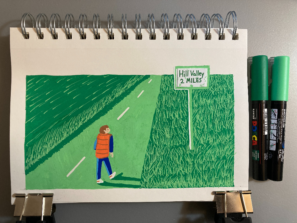
I made this as part of a course on illustrating with Posca pens. The assignment was to use two shades of the same color as the main colors in the piece. Since a lot of this image is grassy fields, I chose two shades of green. I kept Marty’s outfit realistic (orange vest and blue jeans) to signify that he’s out of place…or, more accurately, out of time.
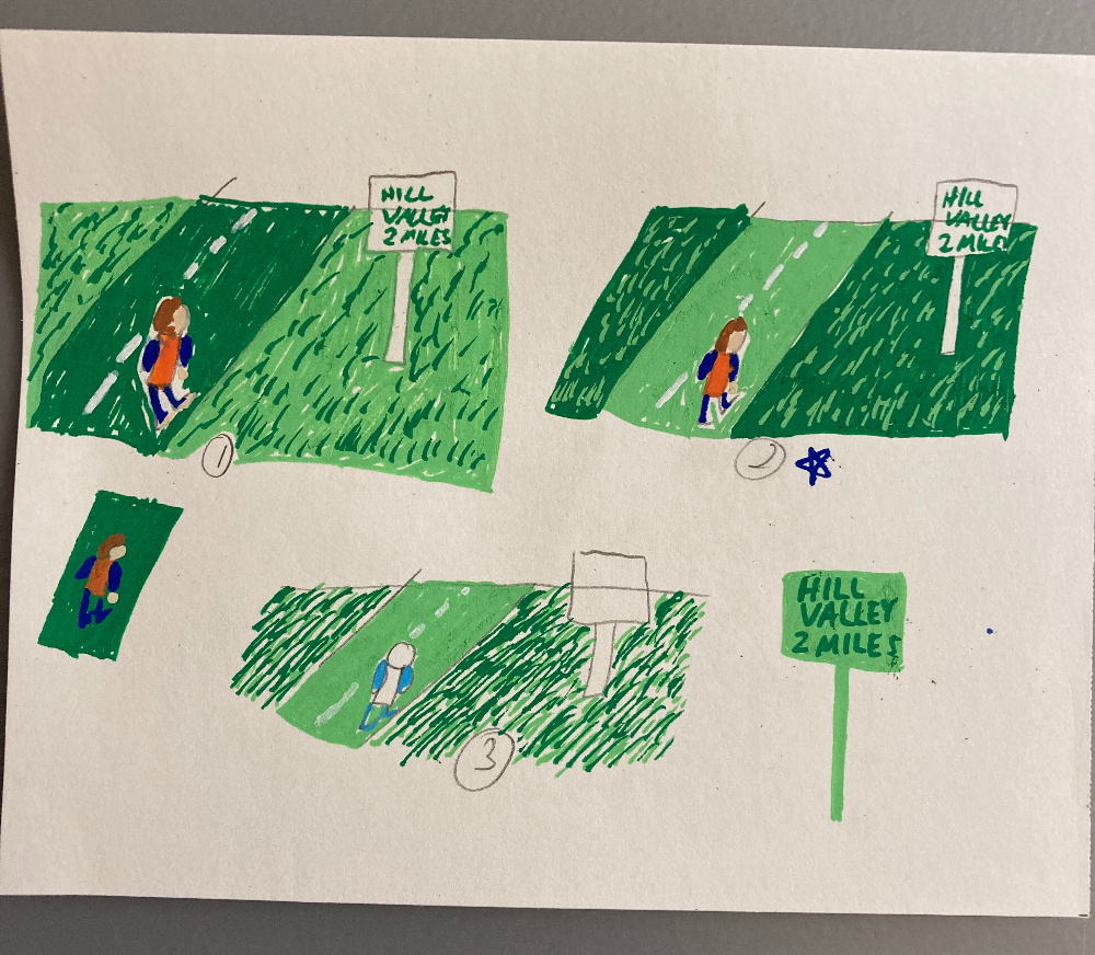
Here are some thumbnail sketches I did prior to painting the scene. I wanted to test out colors–what looked good for the grass and Marty’s outfit.
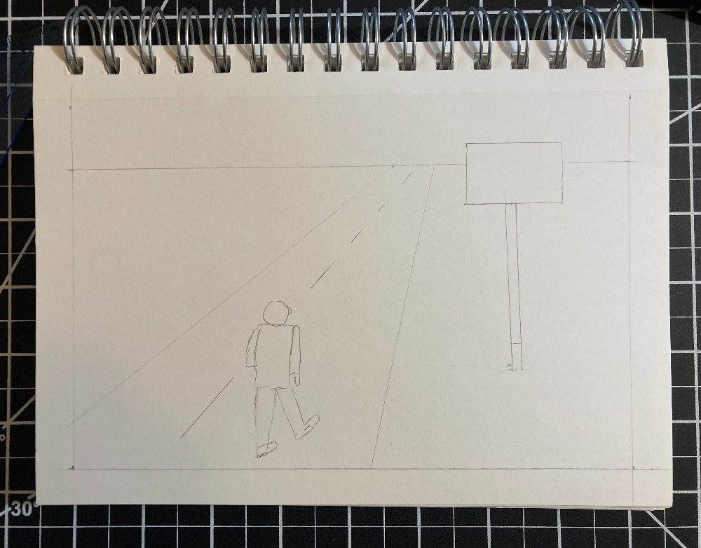
And here’s the simple pencil sketch I started with.
1/28/23
I took an online course on illustrating with Posca pens taught by James Chapman. He has posted lots of his sketchbook pages to his Instagram.
I had a couple Posca pens for a few years, but I hadn’t done much with them. I saw this course and thought it would be a great way to practice with Posca pens.
The course covers how to create a pencil sketch to get the composition down. Then it explores various color schemes to determine how to color the illustration. I especially like the challenge of limiting the number of colors used.
I like the process I learned in this course. It takes me several hours to finish an illustration, but I really enjoy the time I’m spending learning and practicing.
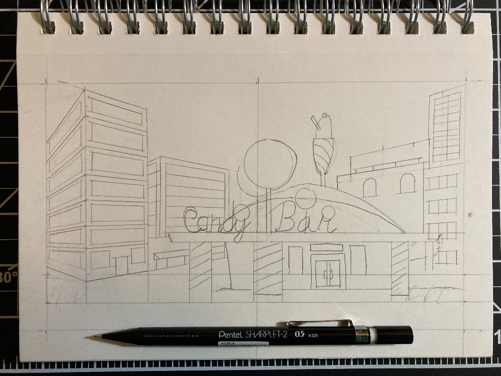
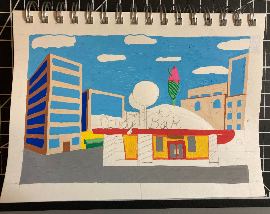
The course encourages choosing a theme that will motivate you to keep working on sketches. I chose places in movies, TV shows, and books. First up is The Candy Bar from Jimmy Neutron.
Here’s the pencil sketch:
I chose to go with realistic colors, so I used Posca pen colors that are close to what this location looks like in the show.
Here’s a progress photo, with the larger areas of color done:
And here’s the finished illustration:
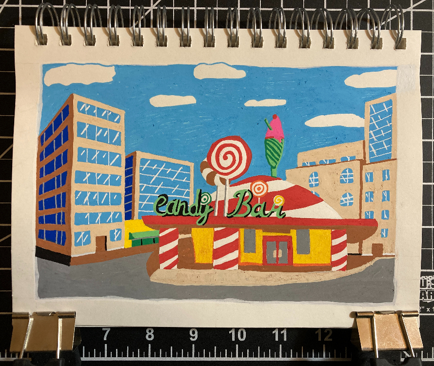
I really enjoyed making this as my first attempt at a Posca pen illustration!